Need a new campus map? Here are a few questions to consider.
Has your campus changed significantly recently? Or do you find that people are constantly confused looking for different buildings? Perhaps, it’s time for a new campus map.
We worked on a map project recently, and here are some key questions that came up.
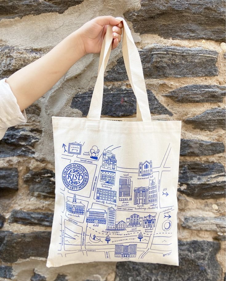
Q1: Do you prefer something true-to-life or more whimsical and illustrated?
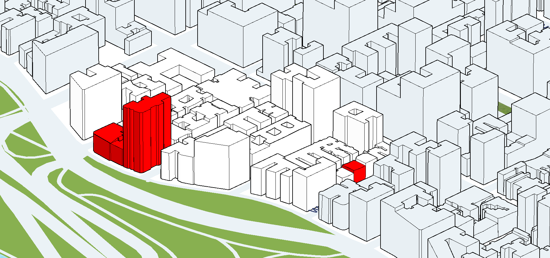
This true-to-life map was designed in a program called Sketchup, which imports Google Maps (our map was similar). The map can be further stylized or edited in Photoshop.
Or you could consider an illustrated map that’s a little more whimsical (something we could work on too). Here are various styles.

Q2: What information do you want to incorporate?
The more information you add, the more complex the map. Think through what you want to include: Entrances, paths, buildings, streets, transportation options, and more. If the visual becomes too busy, you may want to include a key, or start eliminating certain items.
Q3: What’s the perspective on the map?
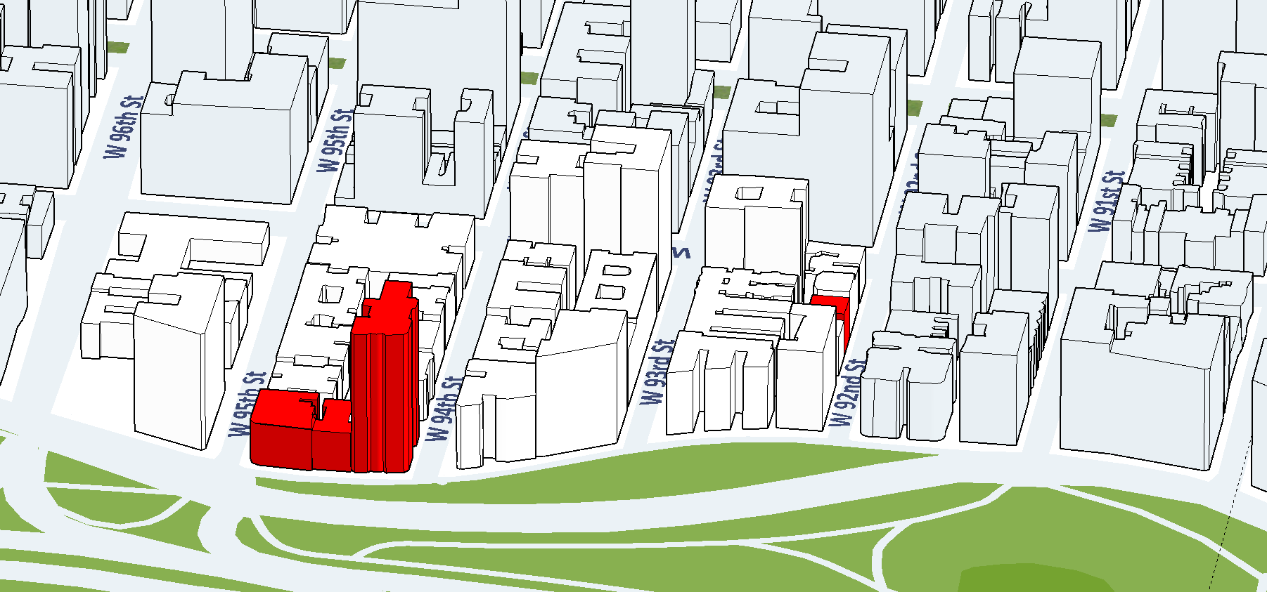
Here’s the same map three times with three different angles. A very different picture emerges. You can easily shift perspective in Sketchup.
Option 1: Looking east, visible roads.

Option 2: Looking northeast, no visible roads.

Option 3: Looking southeast, no visible roads.
Q4: What style do you prefer?
Within Sketchup, there are numerous stylistic options. Here are just a few.

Here’s a “sketched” style with shadow.

Here’s a “sketched” style with shadow, deeper lines, a darker image, and a more textured “paper.”

All colors can be changed as well.

Here’s a version with enhanced 3-D rendering (with the software Lumion).
Q5: What else would you like to do with the map?
Here are some fun possibilities to consider.